Pierre’s Premium Ice Cream
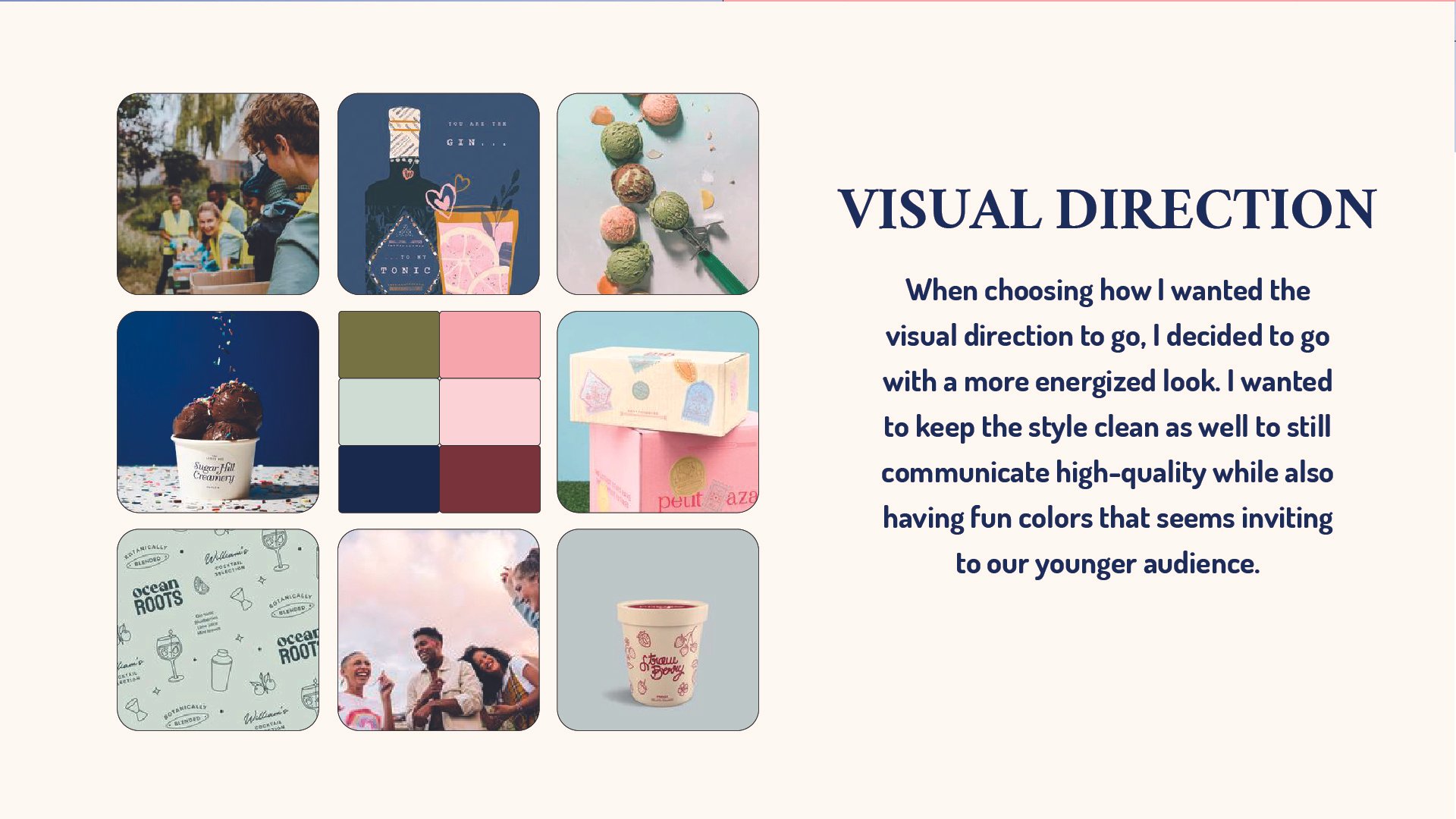
Pierre’s is a premium ice cream shop that offers a variety of options such as sugar free and lactose free in many different favors. Its gourmet ice creams were prepared fresh each day in the back of the store and sold by the cone, the cup, or hand-packed for take home. Their brand purpose is to provide their customers with an unforgettable experience with welcoming workers and high quality richness within their ice cream. The biggest challenge within this project was creating something for a wide range audience. Pierre's is a brand for the whole family to enjoy a fresh and sweet treat. In order to create something clean and fresh but fun and bubbly at the same time l used different areas to target different feelings in the design. When you see the logo it has a very clean, bold san serif font but also has rounded edges to be more welcoming to the customers. The color palette is much more pleasing to the younger audience, using a soft pink and bold blue while not overstimulating the eye of the older audience. For the brand pattern, I decided to use elements to showcase the fresh ingredients that are at use. I believe by using strong strategy, I was able to bring this brand to life that shows a welcoming and luxurious personality.